Solo is a minimalism tiny flex based theme, templated for general website use and focusing on mobile usability. Basic content sections are full width. Footer is full width with three widget sections. Options include content padding; background-color. Theme sets maximum width to 1440px for content comfort readability. Customizer options include three settings tabs: Declaration and
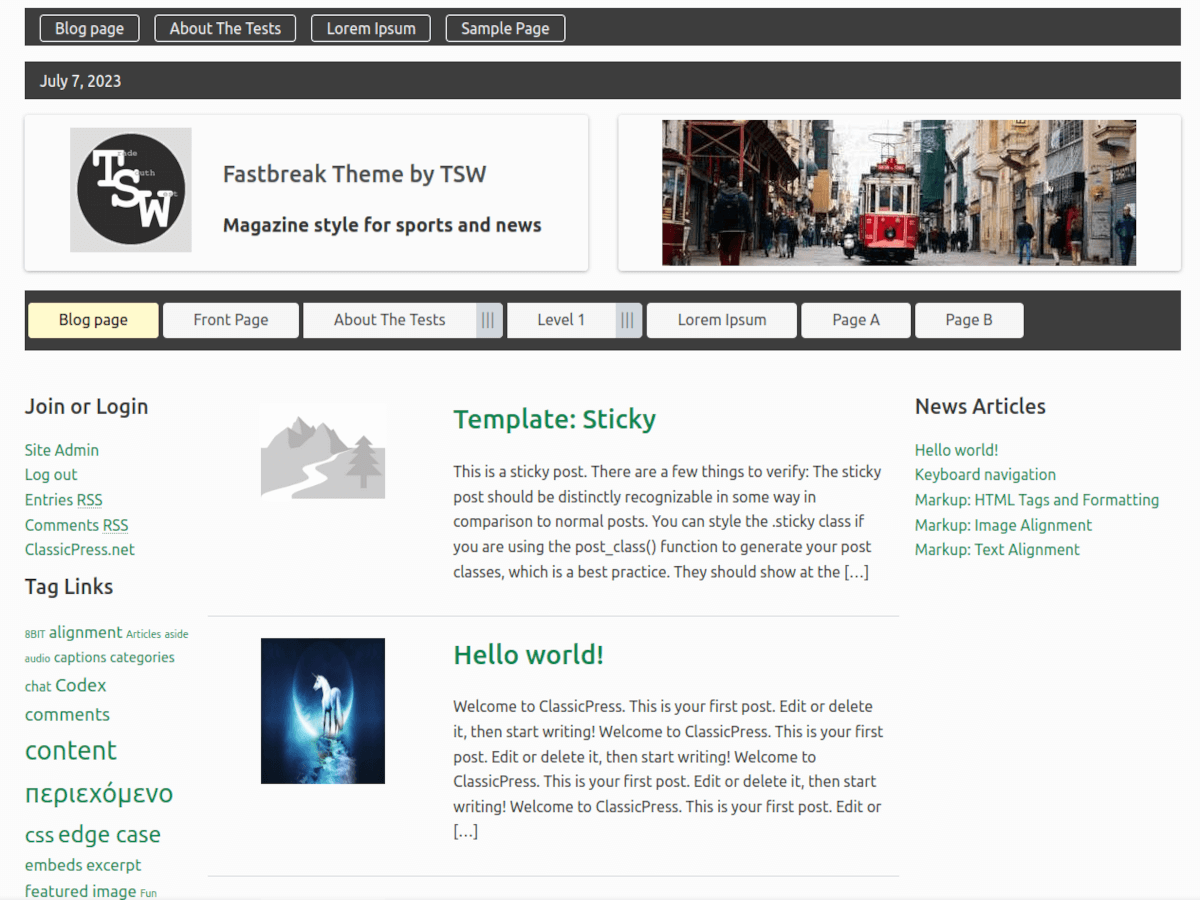
Fastbreak for ClassicPress is a fast and sleek magazine type of layout with mobile ready menus and widgets. Has built in font stack for Helvetica and another for Monsterrat so you don’t need to use an external source to load fonts. Demo at: https://classicpress-themes.com/fastbreak/ Features Custom advert area in header Flex based layouts Fonts Open
ClassicSixteen is a modernized take on an ever-popular WordPress layout — the horizontal masthead with an optional right sidebar that works perfectly for blogs and websites. ClassicSixteen is based on WordPress theme Twenty Sixteen to conform with ClassicPress standards. Fluid grid using a mobile-first approach, and impeccable polish in every detail. ClassicSixteen will make your